
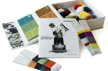
Clariant, a world leader in specialty chemicals, announces the release of ColorForward® Interiors 2018, the fifth annual trend and color forecasting guide for the fiber and textile market.
Annually, an international team of specialists from the Clariant ColorWorks® design & technology centers look at the state of global societal attitudes and forecasts colors that can be expected to connect with consumers on an emotional level in the next few years. All four of the trends identified in the 2018 edition reflect an over-arching feeling of sadness, fear and distrust of the conventional world-as-it-is. This melancholy mood is evident in the fact that all the colors are toned down and a little bit grey. At the same time, however, there is a sense of resolve… a determination to endure and a cautious optimism that people can make a difference and things will get better over time, so many of the colors are also warm, organic and hopeful.
The ColorForward Interiors 2018 presentation kit includes the twenty trend colors, which are presented in the form of pompons made of polypropylene (PP) and polyamide (PA) fibers, and also “wrap cards” with polyester fiber samples.
Brand new in the 2018 edition are carpet samples developed in partnership with Performance Yarn business of Radici Group, Bergamo, Italy. A major producer of synthetic fibers, including nylon, polyester and polypropylene yarn, Radici has a state-of-the-art prototyping machine that is able to make carpet samples in minutes. It was ideal for trying out various color combinations and producing the prototypes in the ColorForward Interiors presentation kit. “For the first time,” says Alessandro Pozzati, Clariant ColorWorks Industrial Designer, “we are able to show people exactly what some of the 2018 colors look like in finished form. Fabric and carpet designers always use a combination of colors and so these samples provide a bridge between the color world and the fibers world. They make it possible for ColorWorks experts to connect more directly with our customer’s design team.”
Although Radici Group knew about ColorForward before, this project brought Arturo Andreoni, Marketing and Application Development Director, deeper into the creative process behind the Clariant color-trend tool. Last year, he saw a presentation on ColorForward Interiors 2017. “I always thought it was an interesting and useful tool for designers who need to catch emotions, follow society’s mega trends and then translate them into new products made with the right colors,” he says. “This year, we worked closely with the ColorForward team, we had a lot of fun following the process, from color selection, to the production of the masterbatch, and finally to the end product: the carpet! It was a great experience to work with such respected people outside of the usual supplier/customer relationship.”
- Fifth edition of trend-analysis and color-design tool
- Consumers Trends suggest disappointment but also determination
- Carpet samples join pompons and yarn wrap cards in presentation kit
The ColorForward 2018 trends and colors include:
Newmorrow
The Newmorrow trend theme reflects a sort of yin-yang mood among consumers. On the one hand, they believe the “system” is rotten; unable to change economic and social conditions that have become intolerable. On the other hand, there is also a conviction that change is still possible… not by government but from grass-roots efforts of individuals and small groups. This change, it is understood, will come only slowly and so there is a need for “cathedral thinking.” Just as it took the work of generations to build the huge medieval churches of Europe, changing and improving a corrupt system requires unselfish commitment, a long-term vision and faith that the final objective can be achieved in the end.
It is not surprising then, that the Newmorrow color palette includes a brownish green called Primordial Soup. It prompts references to sewage and death and some have referred to it as “the ugliest color in the world,” but it also reminds us of the verdant, rich biological goop that spawned life as we know it.
LongitudeLatitudeAttitude
Dissatisfaction with conventional ways of living also stands behind the LongitudeLatitudeAttitude trend theme. It acknowledges that a growing number of human beings are choosing to have no fixed address. These are the “new nomads.” Many are artists, musicians or creative entrepreneurs, but what they really have in common is the desire for a minimalist, wandering lifestyle, limiting their possessions to what they can conveniently carry. These New World citizens cherish the flexibility of a lifestyle that embraces their passion for life on the move and that immerses them in a fusion of ethnicities and interests. The colors of LongitudeLatitudeAttitude are Bohemian. They range from a purplish fucsia, called Nomadness; a warm, almost-orange yellow named Kaleido tribe; and grey blue called Cirrus aviaticus after the contrails of jet planes against the otherwise cloudless sky.
Through the mirror
Somewhere along the way, many consumers began to experience unpleasant feelings of emptiness related to their mainstream lifestyles. There is a sense that they have lost touch with their inner selves; or, perhaps, never really considered that inner self as they felt their way through their lives. The trend theme named Through the Mirror attempts to capture a sense of ennui; of being adrift in a modern world; while, at the same time, knowing that a spiritual reawakening is possible.
The yoga practice of त्राटक inspires the pearl orange color in the Through the Mirror palette. This Sanskrit phrase is pronounced ‘trataka’; and means to gaze steadily at a fixed spot in order to focus the mind inward; blanking out visual perception and withdrawing from the external world.
Nerdylicious
Out from the gloom that seems to lie behind the other trends described above; there comes the story about the validation of a group of people; long stereotyped as a bunch of quirky, overly intellectual misfits – the “nerds”. The Nerdylicious trend theme sees these brainiacs finding acceptance as innovators in a complex world; with continuous curiosity and a passion for exploring new ideas and complex puzzles.
Although the colors of Nerdylicious are soft and subdued like most in the other trend groups; they are nevertheless the brightest and most optimistic in the 2018 palette. For instance, Lightning Boot is a transparent almost-orange yellow that is reminiscent of LED lights on a control panel; while Alberting out! is a slightly dirty optical white — a tribute to the ultimate nerd, Albert Einstein. To learn more about ColorForward, please visit their website. Clariant also offers seminars at its four ColorWorks.